Author Archives: admin

Tutorial: How to build the stegosaurus calendar

Here is a quick photo tutorial for those of you who want to build the stegosaurus calendar.

Very importantly, make sure that you use thick enough cardboard. Something in the range of 300 g/sqm is fine. If the cardboard / paper is too light, the model will easily warp and the cards may no longer fit.

Start with cutting out all parts: Note that there is one part (for the tail) which is inside the right side part. It’s highly recommended to use an X-acto or similar crafts knife.

Next, fold the long center piece and glue it to the side with the “window”. Make sure that the walls are parallel and leave enough space for the cards.

Attach the other side:

Next, assemble the four feet:

… and glue them to the body:

Then attach the tail:

Now on to the head: This looks more complicated than it is. First, before you start assembling the head, cut a slit where the mouth is.

If you are a perfectionist and have a good knife, you can cut out the year and put it into the dinosaur’s mouth:

… and you’re done:

Here is the link to the original template.


Tutorial on making the alphabet letters

2012-08-04

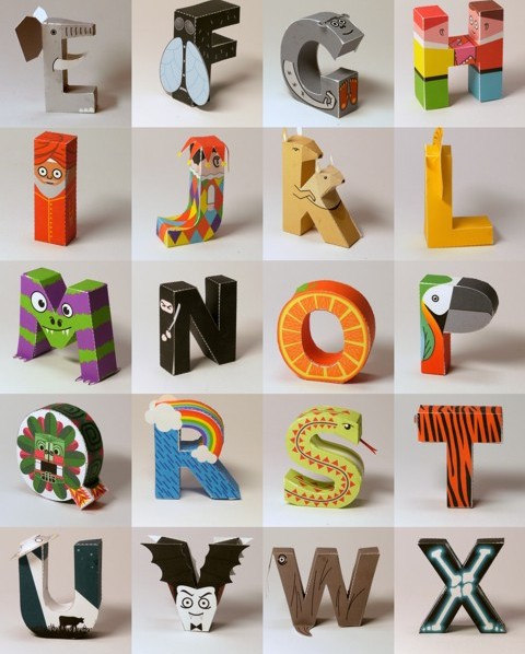
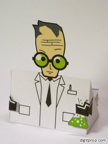
Update: The alphabet is now available as a beautifully printed book. Since it contains the letters already precut, it saves a lot of time.

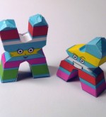
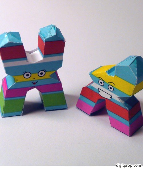
I noticed that the papercraft alphabet created some interest among people who are not (yet) experienced in papercrafting. Therefore, some letters turned out to be a bit too difficult for some, which prompted me to write this little tutorial. The idea is to give you pointers as to where to start.

Here is a video tutorial on the letter J:

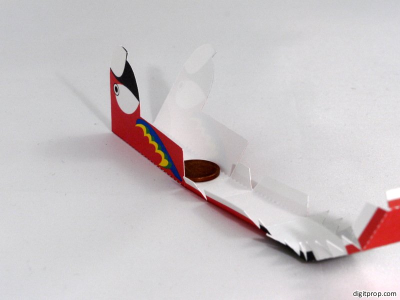
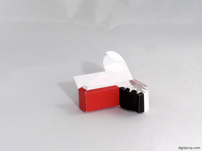
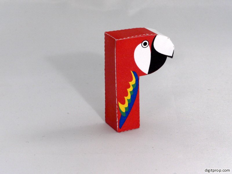
And here is a photo tutorial, I have chosen the ‘R’, as it is one of the more difficult letters due to the curved shape and the inner hole. Print the PDF template onto a sheet of paper or – preferably – cardstock. I use 190g/sqm (about 53 lb) cardstock. Please notice that the strength of the paper should match the size of the model. The letters are about 6cm (2.4 in) high, so 190g / 53 lb is already a bit on the heavy side. For larger models, the paper should be even stronger.

You can print with any printer. Using a laser printer leads to color that is less prone to smearing when getting into contact with glue or water, but inkjet printers usually have nicer colors and gradients.

Originally I said that the first step after printing is to cut out all parts. However, Carol rightfully pointed out in the comments that it might be easier to first score the pieces in the uncut template, and then cut them out. In this way, it is easier to align the scoring tool.

This can be done with a pair of scissors, but for details and holes it is useful to use an Xacto knife or similar sharp, pointed tool. However, please be careful with these: They are much more dangerous than scissors and shouldn’t be given to children.

the next step is to score along the dotted lines, so that the paper doesn’t break when you fold it. This can be done with any object that is pointed but not too sharp. the tip of scissors works reasonably well. In order to score precisely, it’s a good idea to align the tool with a ruler along the straight edges (except for curved parts, of course, where you and your steady hand are on your own):

There is also a dedicated tool for this job, called a bone folder (although these days it’s made from plastics). This is not really required, but if you want to do a lot of papercrafting, it can be a good investment (and it’s really unexpensive). It can be bought in all reasonably well-assorted crafting stores.

Carol suggests to use a knitting needle, which – if you have access to one, which I don’t – might in fact be even better suited – excellent suggestion, Carol!

The next step is to fold everything along the dotted lines. There are mountain folds and valley folds. They are not specifically indicated, but it’s usually easy to determine which is which by looking at how the parts fit together.

With most letters, you have the two faces and a strip that forms the edge. The ‘R’ is no difference – except that it has two strips, one for the hole and one for the outer edge. If you look at how the edge strip aligns with the faces, it is easy to figure out which folds are mountain folds and which are valley folds.

However, even if you make a mistake and fold into the wrong direction, this can be rectified later – once the paper has been folded in one direction, it easily folds back into the other direction as well.

Now it’s time to glue the parts together. For the ‘R’, we start with glueing the inner edge into a circular shape. Make sure that the printed side faces inwards. Then, apply glue to the flaps on one side only:

By the way, speaking of glue: The type of glue doesn’t really matter, you can use any glue suitable for paper. I personally use white ‘crafting’ glue which dries quickly, but not too quickly to realign parts, and is not too runny. It becomes transparent when fully dried, so small smudges aren’t that tragic. However, the paper gets dirty very quickly when covered in glue, and the glue tends to solubilize the printer color (for inkjet dyes at least) – so be carefuly and keep your hands as clean as possible. Perfectionists don’t apply the glue directly out of the dispenser, but with toothpicks.


Glue the part to one of the faces, and make sure that it aligns nicely with the edge of the face:


Now, apply glue to the flaps on one side of the outer strip, and section by section, glue it to the same face. You will end up with this:


You may notice that the whole shape bends slightly, due to the uneven stress on the paper. This will be corrected by the next step: Simply apply glue to all remaining flaps, place the other face onto them and pull and push everything into shape.

That’s it. The whole process is actually not difficult, but takes some time getting used to it. The most important ‘trick’ is to be patient: Apply glue to one section / flap at a time, hold it in place until the glue sticks, then move on to the next piece.

Hätte auch auf Deutsch funktioniert

2012-07-27

Einige wenige Landsleute haben es gefunden, das Papieralphabet, bei dem jeder Buchstabe gleichzeitig ein Ding, Tier oder eine Person ist, die mit diesem Buchstaben anfängt. Die wenigsten haben bemerkt, dass die Buchstaben auch auf Deutsch funktionieren – die Begriffe fangen im Deutschen wie im Englischen mit dem gleichen Buchstaben an.

Also, z.B. “Rainbow” – “Regenbogen” oder “Beaver” – “Bieber”. Probiert’s mal aus. Weil das offenbar einigen entgangen ist und sie gedacht haben, man könne das Alphabet nur einsetzen, wenn man des Englischen mächtig ist, hier nun der explizite Hinweis in Form dieses Posts: Hätte auch auf Deutsch funktioniert. Ich gebe zu, dadurch, dass der Hinweis im englischsprachigen Blog gut versteckt war, lag das Missverständnis nahe – dafür entschuldige ich mich, oder besser gesagt: Sorry! So, und jetzt viel Spaß mit dem Alphabet. Bei der Sommerhitze ist Basteln im Schatten genau das Richtige…

Y is for Yak

This is basically the single one animal starting with the letter ‘Y’ both in English and German. If you have made all 24 letters coming before this one in the alphabet, you will be relieved to fnd that this one is very easy to make.

You will find the other 25 letters of the papercraft alphabet here.

Here is the template as a PDF file.

V is for Vampire

Vampires seem to be quite en vogue these days. Well, I prefer the old-school ones over their ‘new millenium’ counterparts.

I was slightly tempted to include a bit of blood tripping from one of the canines, but then I didn’t want to have to explain to my five year old daughter about the staple diet of vampires.

You will find the other 25 letters of the papercraft alphabet here.

Here is the template as a PDF file.

U is for UFO

Turns out there are surprisingly few concrete nouns in English starting with the letter ‘U’. And technically, UFO is not a noun but an acronym. Anyway, I think for the purpose of the papercraft alphabet, this works quite nicely:

You will find the other 25 letters of the papercraft alphabet here.

Here is the template as a PDF file.

T is for Tiger

The tiger is again easy to make. I realized soon after having finished the design, that he looks much more clueless and much less fierce than his relative, the lion. Sorry, tiger – you may be in for a redesign in the future.

You will find the other 25 letters of the papercraft alphabet here.

Here is the template as a PDF file.

S is for Snake

The snake is vaguely modelled after the Garter snake (with different colors, obviously). It is once again somewhat difficult to build, with all the curvatures. Prepare to be patient with this model and glue segment for segment, making sure that each part is solidly sticking before moving on to the next one.

You will find the other 25 letters of the papercraft alphabet here.

Here is the template as a PDF file.

P is for Parrot

The parrot is once again an easy template, except maybe for the curvature of the beak. Very importantly, don’t forget to glue a small weight into the base – such as a small coin. Otherwise, the parrot will fall over.


Here is how to make the P (the photos are a slightly updated version from the Alphabeticals book): First, glue a small weight (such as a 1 cent coin) to the back of the parrot, from the inside, near the bottom. This will allow the parrot to stand up and not fall over:

P1320440

Next, glue the edge faces to one of the two P sides, following the outline:

P1320443

Finally, close the shape by gluing the remaining P face to the edge.

P1320446

You will find the other 25 letters of the papercraft alphabet here.

Here is the template as a PDF file.

O is for Orange

Making the orange ‘O’ is a bit difficult because of the inner ring. I suggest you start with gluing it to one side, then the outer ring to the same side, then cover everything with the other side.

You will find the other 25 letters of the papercraft alphabet here.

Here is the template as a PDF file.

N is for Ninja

Congratulation: If you made all other letters in alphabetical order, you are now halfway there – this is the 14th of the 26 letters.

In typical ninja fashion, this guy is quite sneaky: If you approach him from the front, he looks just like a plain and inconspicuous letter N. Only if you look at the side, you will notice that this is a fierce ninja ready to jump at you from out of the shadows.

Having the ninja clad in the black signature clothes is actually historically pretty inaccurate. The black ‘uniform’ originates with the Japanese Kabuki theater. However, nobody would recognize a ninja if it weren’t for the black clothes – ironically, as they were supposed to make the stage hands in the Kabuki theater invisible.

You will find the other 25 letters of the papercraft alphabet here.

Here is the template as a PDF file.

I got a request for a version without sword, suitable for small children – here it is.

K is for Kangaroo

Technically, this letter is actually two animals – mother kangaroo and her joey in the pouch.

I should warn you that cutting out and assembling this letter is a bit challenging – the parts around the faces are quite small.

You will find the other 25 letters of the papercraft alphabet here.

Here is the template as a PDF file.

H is for Handshake

Probably the most abstract of the papercraft letters – the handshake:

I only realized after the fact that these guys have but one hand. Well, I think the letter still works as it is, but maybe this is a good candidate for a revised version sometime in the future.

You will find the other 25 letters of the papercraft alphabet here.

Here is the template as a PDF file.

F is for Fly

Ok, I admit I had struggled a bit with the animal for the letter F. Flies are not exactly my – or, I imagine, most people’s – favourite pet:

No need to even pretend this is cute, but hey – there aren’t too many animal names starting with the letter F both in English and German.

When you build this, it is very important that glue a small weight – such as a cent coin – into the base, otherwise the center of gravity will be too far to the right and will make the fly fall over.

You will find the other 25 letters of the papercraft alphabet here.

Here is the template as a PDF file.

Determining the length of a curve in Corel Draw 11

2012-06-21

When designing in Corel Draw, it can be very useful to know the total length of a curve. Since the curve may consist of straight and curved sections, this is not trivial, and unfortunately the user interface doesn’t help you here – it only tells you the width and height of an object.

So in order to get that length, use this Visual Basic macro:

Sub getLineLen()
 Dim sel As Shape
 Set sel = Application.ActiveDocument.ActiveShape
 Dim l, sl As Double
 Dim seg As Segment
 Dim prevu As cdrUnit

 prevu = Application.ActiveDocument.Unit
 Application.ActiveDocument.Unit = cdrMillimeter

 For Each seg In sel.Curve.Segments
 sl = seg.Length
 l = l + sl
 Next seg
 MsgBox ("Length: " & l)

 Application.ActiveDocument.Unit = prevu
End Sub

This should work in other versions of Corel Draw, too, but I could verify that for version 11 only. In order to make this work, go to the menu item “Tools -> Visual Basic -> Visual Basic editor…”. Click on “GlobalMacros”, then on “Module” and “CorelMacros”. Paste the code at the bottom of this text file. Then click on File -> Save.

To use the macro, select the relevant curve, then click on “Tools -> Visual Basic -> Execute…”. Select the macro from the list (select “Macros in” “all standard projects”) and click on “Execute”. The length of the curve will appear in a small message box.

Cubicity model #019 – Volkswagen bus

Here’s a treat for all you hippies out there – a true to the form Volkswagen bus. As a child, when these were a common sight on the streets, I always dreamed of having one for the family. In the 70ies and 80ies, a Volkswagen bus was the pinnacle of self-propelled transportation. So it was only natural that Cubicity had to have these as well. I will add more color variants soon, but for now you have to live with the lemony yellow.

Here is the template.

And here – by request – is a red version

Since this is a simple box – as are all Cubicity models – you can actually use it to stow away / carry Cubicity people. About six to eight should fit in there comfortably.

Cubicity model #018 – Grandmother

This is Grandma. Well, I’m not exactly sure who’s Grandma anyway, but it’s always useful to have one of the elder nice ladies around. Kasperl and Seppl will claim she’s theirs, but as far as I can tell the two are neither siblings nor cousins, so it’s obviously more complicated than that. Anyway, she will always be there to give you a nice warm piece of fresh apple pie, independent of whether you have family relations with her or not.

Here is the template.

Cubicity model #017 – Seppl

This is Seppl, Kasperl’s best friend and trusted companion. In the traditional German Kasperltheater he usually looks like the stereotypical Oktoberfest German, what with his Lederhosen and pointy green hat. Being reduced to a cube, there is not much left of the pointy hat, but I am somewhat partial to the slightly bizarre cap into which the hat turned:

The name Seppl, by the way, is a short form of ‘Josef’ – just like Joe is in English.

Here is the template.

Cubicity model #016 – the King

2012-01-19

Royalty has arrived in Cubicity – all hail the king! He is without a queen, as of now (but this should change in the not too distant future), but nevertheless the proud and just ruler of his square kingdom.

Here is the template.

Cubicity model #014 – Gretel

2012-01-18

This is Gretel, the traditional female lead in the German Kasperl theater, where she plays a similar role as Judy for Mr. Punch. Gretel is very mild tempered and good-natured, and her most important task is to keep Kasperl’s antics at bay.

Here is the template.

Cubicity model #012 – Crocodile

At first glance, you might confuse the crocodile with the swamp monster, both being green and somewhat menacing and all. Crocboy, however, would strongly object. He claims to actually be quite a nice and wellbehaving crocodile, who’d never do anybody harm. Big boyscout promise.

Here is the template.

Cubicity model #010 – palm tree

Here are happy little trees to go with the cubicity population. Not exactly a precise copy of nature, but the boxy people like them. When you make them, you assemble them like they were just a rather long box. However, since they have cuts along their four sides, you can push the top down, so that the ‘leaves’ fold out.

Here is the template.

Cubicity model #008 – Scientist’s swamp monster

Meet Swampy the swamp monster. Swampy was created by the scientist (yes, you heard right: The scientist) in one of his many failed experiments to solve the problem of mortality. Although his appearance may suggest otherwise, Swampy is very good-natured and an A-ok monster. At least as long as it’s near his master…

Here is the template.

Cubicity model #007 – Scientist

You can’t call him exactly an egg head, but he lives for science and for science only. A truly brilliant mind, he is constantly occupied with sciencey stuff. Which seems to be quite dangerous, or why else would he need these immense safety goggles?

Here is the template.

Cubicity model #005 – Theodore the cat

The first cubicity animal (stay tuned for more of the little critters). As far as cats go, Theodore is a pretty relaxed and mellow guy. Be careful, though: He knows he’s pretty cute, he is fully aware of the godlike status of cats on the internet, and he doesn’t hesitate to use this knowledge to his full advantage.

Here is the template.

Cubicity model #003 – Lucy

Hi, meet Lucy. She is the daughter of Mr. Tuxedo guy and the blue lady.

If you ask her brother Dirk, he will tell you that Lucy can be a real nuisance. Being the older sister, the balance of power is certainly tipped towards her, but Dirk has a few tricks of his own up his sleeve.

Here is the template.

Red lines (unconnected edges) in Pepakura

2011-06-05

I work with the combination of Blender and Pepakura for creating paper models. Sometimes it so happens that a seemingly perfect model in Blender has unconnected edges in Pepakura. These show up as red lines and result in a model where two faces are not connected although they should be.

There are several causes. One is that one or more vertices are duplicated, i.e. that two vertices are positioned at the same location. To fix this, go into Edit Mode, then press A to select all vertices, then press W and “Remove doubles”.

If that doesn’t help, in Edit Mode press ctrl+alt+shift+M. This selects non-manifold edges, i.e. edges where the model is open. Then press alt+M in order to merge the affected vertices.

If the problem still persists, you can recalculate the normals. Go into Edit Mode, select everything (press A), then press ctrl+N. The problem in this case is that each face of your model has an orientation. You can think of it as the “front” and “back” of the face. The so-called normal is a vector perpendicular to the plane of the face. Since the face has two sides, the normal can point in either of two directions. If a model consists of a contiguous surface where the normals of some faces are oriented differently than those of the other faces, Pepakura assumes that the surface isn’t actually contiguous (and rightly so).

In most cases, ctrl+N solves this problem automatically. However, there are some models which do not enclose a space completely, but which contain openings. In such a case, Blender may fail to orient all faces properly. You will see the problem in Pepakura by two sets of faces, one showing the texture (or face color) on the “outside”, and one showing it on the “inside” (double quotes, as technically there is no such thing as in and out for a model with openings). You can switch the orientation of the normals manually in Blender – here is a tutorial.

From Blender to Pepakura to Corel Draw to CraftRobo

2011-05-08

Blender is an excellent open-source 3D modelling application. Pepakura Designer (short: Pepakura) is a very useful tool for papercrafting, which converts 3D models to 2D templates which can be printed on paper, cut and assembled into the original 3D model.

The two are a great combination for papercrafting. In fact, I found the combination of Blender for 3D modelling, Pepakura for unfolding, Corel Draw for postprocessing, adding artwork and finetuning, and finally CraftRobo for cutting perfect. Here is the complete workflow:

First, you need to export the Blender model to the 3D Studio format understood by Pepakura.

Go to

File > Export > 3D Studio

then save the file. Then, simply open the file in Pepakura. Once you have created a satisfactory 2D pattern, the next step is to get it into Corel Draw. There are several vector export formats available in Pepakura, however all of them have some problems. I found the best one to be DXF (AutoDesk’s ‘Drawing Interchange Format’).

In Corel Draw, click on

File > Import

then select ‘DXF AutoCAD’ as file type and select the file exported from Pepakura. You will then be able to place the file into your existing page, by pressing LMB and dragging the mouse until the shape has the correct size.

Note that the DXF format separates the shapes for folding and cutting into different layers, which are preserved in Corel Draw. This is very convenient when you want to process them differently (such as assigning them to different cutting types for the Craft Robo).

One important drawback of the DXF format is that Pepakura chops up the outline of a shape into individual edges. This can be difficult to work with in postprocessing. Therefore, another option is to use the EPS format. Here, you need to carefully c0lor all cutting edges in the same color in Pepakura. This will create a contiguous outline in the EPS file. Unfortunately, the EPS file does not preserver the color information itself, so all edges – folding and cutting – are black, and you have to separate them manually.

You can now add artwork and edit the shapes, if necessary. Once that is done, you can simply send the file off to the Craft Robo for cutting. I keep the folds and cuts in different layers (see above) and assign the following cutting parameters:

Folds: Index 90lbs paper, 10cm/s, force 30, line type: Custom 1 (0.120 cm a, 0.120 cm b), Passes: 1

Cuts: Index 90lbs paper, 10cm/s, force 30, line type: 1, Passes: 2

Converting AVCHD files to MPEG-2, MPEG-4, AVI or WMV

It so happens that my Panasonic GH-1 is capable of spitting out so-called AVCHD files (with the extension .MTS). AVCHD is supposedly superior to older video encoding formats, but a lot of old software (such as Adobe Premiere Elements 3) cannot process it.

Being a strong proponent of not touching a working system, and seeing that Premiere Elements 3 still works quite well for me (except for, ahem, AVCHD import), I looked for inexpensive ways to convert such files to MPEG-2. And, lo and behold, I was successful:

There is a freeware that does the trick quite neatly, the aptly called Free-HD-Converter. Now, be careful: This piece of software is indeed free, but during installation it tries to install rather spammy looking browser toolbars. I unchecked these options (one cunningly starts with ‘accept terms and conditions’ … of the toolbar, that is).

If you avoid these toolbars, everything else seems rather fine. The user interface is very straightforward, there are several options with regard to the output format, and that’s about it. Conversion is taking some time, on my (admittedly rather old) system, the conversion frame rate is about 3 fps, which means that one minute of video takes about 10 minutes to convert.

Infrared photos

I noticed that there are still some hits for the infrared photos I had up on the site a long time ago. Those were taken with a Canon G2 – still a nice camera, although it feels like a toy these days, now that I am used to the Panasonic GH-1. And I guess there is equipment out there, compared to which the GH-1 feels even more like a toy.

Anyway, I digress. Here are the photos – I have uploaded them to Flickr:

For an IR filter, I have used an ORWO 585. This is a lowpass filter which passes light below 790nm. It’s not completely opaque above that threshold, but you have to look at a very bright light source to see a faint violet spot through it, so for all practical purposes it works well.

As you may know, the Canon G2 – like almost all other digital cameras – has a built-in IR filter. This is because the CCD sensor is very sensitive to IR light, and would otherwise produce images which are quite different from the usually intended standard film look.

Fortunately the G2 filter is not completely opaque for IR light, so it works in general, but you have to accept long exposure times and off-the-balance autofocus. This means working with a tripod and manual focus in as bright daylight as you can get. Don’t even think about doing this on an overcast day.

Paper model of the Reddit logo

2011-04-09

This is my stab at a paper model of the Reddit logo. The rounded shapes of the logo do not lend themselves well to papercrafting, and so a paper model will either be very complicated to assemble or inaccurate. I took the easy road and made a rough approximation, which only looks good from the front. Well, at least it’s relatively easy to assemble.

If you want something more refined, look here.

Here is a glimpse at the not so elegant backbone structure:

And here are the parts:

And here is the template (see also instructions here):

Assembly should be easy: First, glue the large strip into a cylinder – this will be the “body”. The body, head, and feet are connected by sliding them into assembly slots cut into the opposing part. The head has two strips which interconnect via the same slots. They form an ‘X’ which can then be inserted into the slots in the body cylinder.